
In today‘s digital world, images are not just an add–on for your content but are often the first impression for your audience. Think about it – when you are scrolling on social media, browsing on a website, or even looking at an ad, the image is what stops your scroll. But, with most people posting every day, how do you stand out?
That‘s where the duotone effect comes to play. Sleek, modern, and undeniably trendy, duotone images are everywhere– from Spotify playlist covers to high-end marketing campaigns. And now with Writecream‘s Duotone Effect Generator, you are no longer required to be a professional designer to make them. This free AI tool will let you change any image into a beautiful duotone piece in a matter of seconds.
This blog will guide you on how to use the duotone tool from start to finish, discuss why duotone is a fantastic method for designing visuals, and give you tips on how to visually stand.
What is the Duotone Effect?
It’s likely that you have already seen a duotone application:
-
Spotify’s branding uses a neon duotone throughout its playlists and promotional pieces.
-
Advertising campaigns involve duotones to gain attention and add personality.
-
Social media influencers use duotones to create a branded feed.
The use of duotones is not only a cool effect, but also a way to tell a visual story using color.
Why Duotone Visuals Are So Popular
The duotone look isn‘t just a fad—it‘s a design strategy with several advantages:
-
Instant Visual Impact
Duotone images are bold. They cut through the clutter of a busy feed or overcrowded webpage. -
Brand Alignment
By choosing colors that match your brand by selecting duotone colors based on your brand colors, duotone images reinforce your brand consistency and brand identity. -
Emotional Connection
Colors are strong communicators of story. A blue-purple duotone feels futuristic—whereas a yellow-pink duotone seems fun and lively. -
Timeless Yet Modern
While duotone started in print design, reviving it in a digital landscape gives it a contemporary feel. -
Versatility
It doesn‘t matter if it‘s a poster, banner, Instagram post, or ad campaign, duotone images look great on platforms across the board.
Simply put, if you want the viewer to remember your images, think duotone.
Meet Writecream’s Duotone Effect Generator
In the past, creating duotone effects required jumping into Photoshop or Illustrator – both amazing software, but not for beginners, and they could be expensive. It could feel very intimidating for someone with no design skills.
Enter Writecream’s Duotone Effect Generator – this is a game-changer. It‘s free, it’s online you don’t need any technical knowledge it’s powered by AI.
Key Features:
-
AI-powered automation: The tool does the heavy lifting for you.
-
Free & accessible: No subscription fees or hidden charges.
-
No downloads required: Everything runs on your browser.
-
Customizable color choices: Align visuals with your branding or experiment with bold combinations.
-
Instant results: Transform any image in seconds.
Whether you’re a student, business owner, marketer, or content creator, this tool makes professional-level visuals accessible to everyone.
Step-by-Step Guide: How to Use Writecream’s Tool
Now, let’s walk through the process of creating your own duotone image.
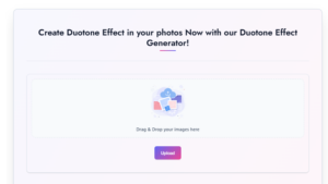
Step 1: Open the Tool
Go to Writecream’s Duotone Effect Generator. The interface is clean and user-friendly—no clutter, no confusion.
Step 2: Upload Your Image
Pick a photo you want to enhance. It could be a portrait, product photo, landscape, or even a casual click you want to stylize.
Step 3: Choose Your Colors
Here’s where the fun begins! Experiment with color pairings. Some ideas:
-
Blue + Purple: Futuristic and cool.
-
Orange + Teal: Energetic and cinematic.
-
Black + Red: Bold and dramatic.
-
Yellow + Pink: Playful and vibrant.
Step 4: Generate the Effect
Click the button, and in seconds, your duotone visual appears. The tool automatically balances the tones to ensure your photo looks professional.
Step 5: Download & Use
Happy with the result? Download the image and start using it in your designs, campaigns, or posts.
That’s all it takes—five easy steps to a professional-looking duotone masterpiece.
Pro Tips to Get the Best Results
Check out a few insider tips to maximize your duotone impact:
-
Experiment Boldly
Avoid playing it safe with color combinations – be bold with choices that stand out! -
Keep it Simple
Duotone makes its best impact when you aren‘t relying on a significant amount of text or other design elements. -
Stay On-Brand
Pick colors that reflect your company or personal brand for consistency. -
Match Mood with Colors
Want excitement? Go for bright tones. Want sophistication? Stick with dark, moody palettes. -
Test Across Platforms
Check out your graphics on both mobile and desktop so they look amazing all around.
Why Writecream Stands Out from Other Tools
There are plenty of duotone products on the market, why would I pick Writecream? Here are the differences:
-
Ease of use: No surprises with a steep learning curve, like Photoshop.
-
Completely free: Lots of tools gatekeep their features behind subscription plans and tiers to unlock trump all of their free–to–use features.
-
Speed: Create, download, and share in under a minute.
-
Accessibility: Runs on any browser, no installations needed.
-
AI advantage: Automated adjustments ensure your duotone looks balanced and professional.
It’s not just about editing photos; it’s about giving everyone—designers and non-designers alike—the power to create.
