
Color Contrast for WCAG Compliance: 5 Powerful Reasons to Use WriteCream’s Accessibility Tool
The world nowadays is faster-paced and very digital, a point where accessibility is no longer a nice-to-have but a need. Having your content to be available to all the people, including the visually impaired, is both an ethical and legal duty since millions of people use the services of websites to engage in communication, education, entertainment, and other fields. Color contrast is one of the most important, yet little known features of digital accessibility. This is the place where WriteCream Advanced Accessibility Tool can help. Ensure readability, inclusivity of design, and ensure your site is WCAG-compliant in a few clicks with our WCAG Contrast Checker.
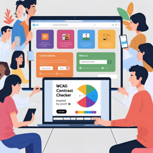
“Easily check color contrast for WCAG compliance using WriteCream’s advanced accessibility tool.”
What is Color Contrast for WCAG Compliance?
WCAG represents Web Content Accessibility Guidelines, created by the W3C (World Wide Web Consortium) to enable digital content to be more accessible to people with disabilities. These specifications are well known around the world and they are frequently enforced by law in the form of regulations such as ADA (Americans with Disabilities Act) or European Accessibility Act. Color contrast, or the luminance difference between foreground (e.g. text) and background colors, is one of the major elements of WCAG. Lacking adequate contrast, users who are color blind or low vision, or who have age-related vision problems might not be able to read without a struggle.
Why Color Contrast for WCAG Compliance Matters?
Consider this an example: You create a gorgeous site where you have soft pastel backgrounds and light gray text. It is slick-looking, but text of yours is invisible to many readers. Color contrast Poor may result in: A high walk off rate Loss conversions Legal issues Brand damage WCAG suggests the following to be the minimum contrast ratio of text and background: normal text 4.5:1 3:1 in big fonts 7:1 to improve the accessibility (AAA level)
Introducing WriteCream’s Color Contrast for WCAG Complaince
WriteCream has developed a tool which is not only about the color code verification. Full of smart AI, our WCAG Contrast Checker is targeted to designers, developers, marketers, and accessibility consultants. The main features: Real Time Contrast Assessment Enter your text and background colors, and get instantly whether they obey WCAG AA or AAA standards. Several Formats Erected Supports HEX, RGB and HSL- all you need to be able to work in any design environment. Accessible UI It is expected to be used by all people, including persons with disability. Suggestion Engine When your color combination does not pass WCAG, the tool indicates accessible alternatives that will still operate within your brand palette. Batch Checking Option Feel like trying out several color color combinations? No problem. Our tool enables an auditor to perform much more testing in bulk.
For your website mobile app or marketing stuff? Make sure color contrast is accessible; it’s super important now. This WriteCream thing can save time cut down redesign headaches helps keep true accessibility worldwide. Creators build confidently knowing readers find their digital stuff inclusive and compliant yet true to your style. This tool? It helps make web—from little startups or big orgs—more inclusive plus accessible.
How to Use WriteCream’s Color Contrast Checker for WCAG Compliance
It is really easy to use our tool: Go into the Accessibility Tools Section of WriteCream Key in your HEX/RGB/HSL values of text color and background color Press the button Check Contrast Instantly view: Für WCAG compliant level (AA, AAA) Contrast ratio Pass/Fail badges Discover recommended color adjustments in case of need It will take you less than a minute to find out whether your design is accessible!
Who Should Use This Tool?
It does not matter whether you are a single entrepreneur or work in a large dev team, as you are the one this tool is geared towards. Web Designers and Developers Prevent design errors within the first periods of your construction. ui ux designers Make sure that all the aspects of your user experience are accessible by including accessibility standards. SEO and Marketing Experts User-friendly material contributes to better search deployment and increases your coverage. Organizations and Educational Institutions Be law compliant when creating the inclusive spaces on digital platforms.
The SEO & UX Boost of WCAG Compliance
Contrast in color is not merely about accessibility, but also about keeping the users and improving the SEO. Google and other search engines favor easy to reach sites. The greater contrast, the better readability, the longer the stay on page. This increases user satisfaction = increase in conversion rates. By looking into check contrast, you are working on design, experience, and ranking, all in one.
Real Use Case: How One Brand Boosted Accessibility and Engagement
A small e-commerce company utilized the contrast checker of WriteCream to remodel the pages of products. Switching to the available sets of contrast: There was also a 22 percent decrease in their bounce rate there was a 35% increase on time-on-site The satisfaction in customers was increased particularly in the case of consumers who had color blindness All they did was to check their color scheme and make some slight adjustments and be aligned to WCAG standards.
Pro Tips for Better Color Contrast for WCAG Compliance
Do not use light text on light backgrounds (e.g. yellow on white) Do not use color as the only mean of conveying information (use underlines or icons to show links) Hover/focus buttons and links Apply the batch checker available on WriteCream into your QA process in design
Conclusion: Accessibility Starts with Color Contrast for WCAG Compliance
Digital accessibility takes color contrast as a basic step. The WCAG Contrast Checker created by WriteCream is a simple, quick and intelligent tool of accessibility, compliance and efficient websites. Are you willing to make the web more accessible?
👉 Try WriteCream’s WCAG Contrast Checker now and start making your digital space more inclusive, one color combo at a time!